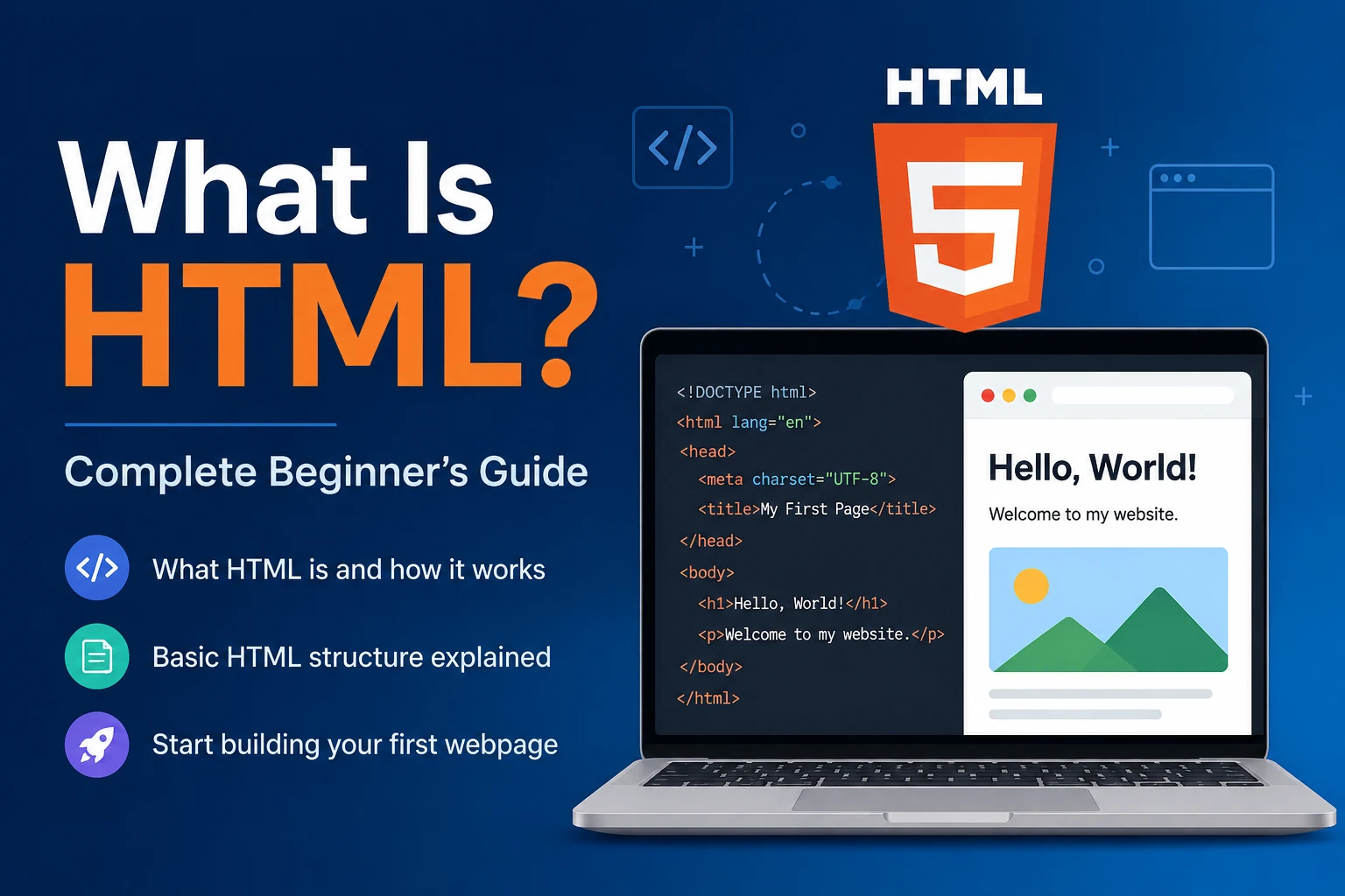
If you are learning web development, you will quickly come across three important technologies: HTML, CSS, and JavaScript.
HTML is used to create the structure of a webpage, CSS is used to control its appearance and layout, and JavaScript is used to add behavior and interactivity.
In simple terms:
HTML creates the structure, CSS makes it look good, and JavaScript makes it interactive.
CSS is one of the most important technologies for frontend web development. Whether you are creating a simple personal website, a business website, an e-commerce store, a dashboard, or a complex web application, CSS plays an important role in designing the user interface.
This beginner’s guide explains what CSS is, how it works, why it is important, its syntax, selectors, colors, layouts, responsive design, Flexbox, Grid, animations, and more.
What Is CSS?
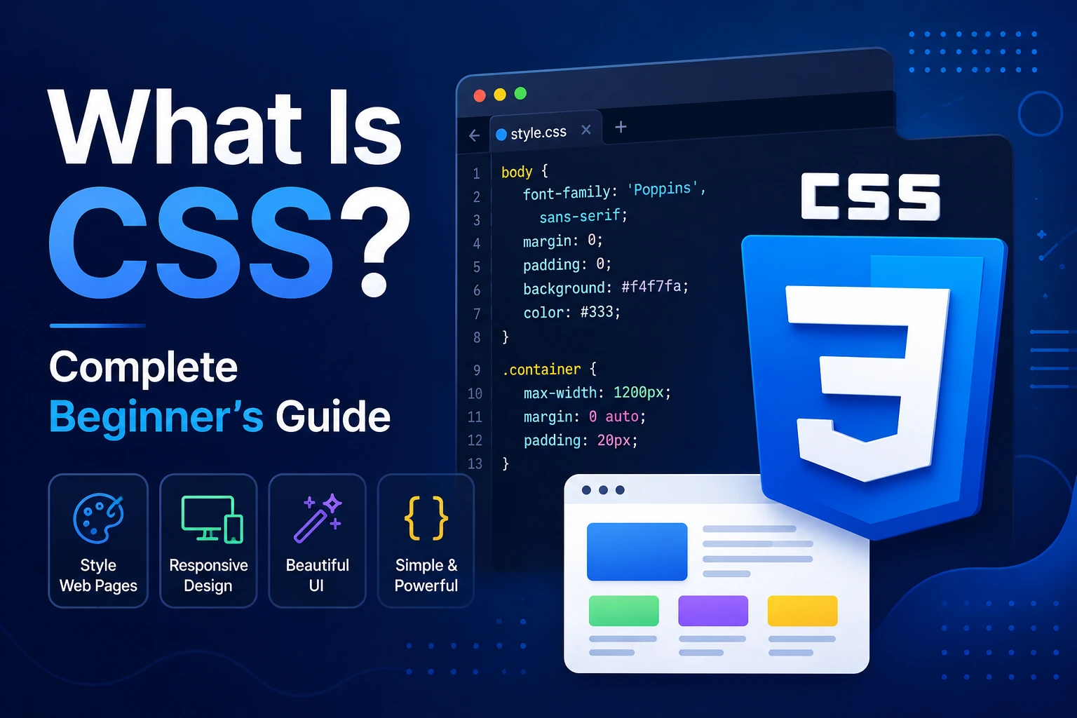
CSS stands for Cascading Style Sheets.
CSS is a stylesheet language used to control the visual appearance, layout, and presentation of HTML elements on a webpage.
With CSS, developers can control things such as:
- Colors
- Fonts
- Text sizes
- Spacing
- Borders
- Backgrounds
- Width and height
- Page layouts
- Buttons
- Navigation menus
- Images
- Responsive designs
- Animations
- Transitions
For example, HTML can create a heading:
<h1>Hello World</h1>
CSS can change its appearance:
h1 {
  color: blue;
  font-size: 40px;
}
The HTML defines what the element is, while CSS defines how that element should look.
Why Is CSS Important?
Without CSS, most webpages would look extremely basic.
HTML provides elements such as:
Heading
Paragraph
Image
Button
Link
List
Table
Form
CSS allows developers to transform those basic elements into a professional user interface.
For example, a simple button:
<button>Login</button>
can be styled with CSS:
button {
  background-color: #2563eb;
  color: white;
  padding: 12px 24px;
  border: none;
  border-radius: 8px;
}
Now the button can have:
- A background color
- White text
- Proper spacing
- Rounded corners
- A modern appearance
This is one of the primary purposes of CSS.
HTML vs CSS vs JavaScript
Modern websites commonly use three core technologies.
| Technology | Main Purpose |
|---|---|
| HTML | Structure and content |
| CSS | Styling and layout |
| JavaScript | Behavior and interactivity |
Think of a website as a house.
HTML = Structure
HTML creates:
- Walls
- Doors
- Rooms
- Windows
CSS = Design
CSS controls:
- Colors
- Furniture arrangement
- Decorations
- Sizes
- Layout
JavaScript = Behavior
JavaScript can make things happen:
- Open menus
- Validate forms
- Load data
- Display notifications
- Update content dynamically
A simplified relationship is:
HTML
 ↓
Page Structure
 ↓
CSS
 ↓
Visual Design
 ↓
JavaScript
 ↓
Interaction
Together, these technologies form the foundation of modern frontend development.
How Does CSS Work?
When a browser loads a webpage, it reads the HTML and CSS and uses them to create the final visual page.
A simplified process looks like this:
HTML File
   +
CSS File
   ↓
Browser
   ↓
CSS Rules Applied
   ↓
Layout Calculated
   ↓
Page Rendered
For example:
<h1 class="title">Welcome</h1>
CSS:
.title {
  color: blue;
  font-size: 32px;
}
The browser identifies the element with the title class and applies the CSS rules.
Basic CSS Syntax
A CSS rule generally looks like this:
selector {
  property: value;
}
For example:
p {
  color: black;
  font-size: 16px;
}
There are three important parts.
Selector
p
The selector identifies which HTML elements should be styled.
Property
color
The property identifies what you want to change.
Value
black
The value specifies how that property should be configured.
Together:
p {
  color: black;
}
means that paragraph text should be black.
Different Ways to Add CSS
There are three common ways to add CSS to an HTML document.
1. Inline CSS
CSS can be written directly inside an HTML element.
<p style="color: blue;">Hello World</p>
This is called inline CSS.
Advantages
- Quick for testing
- Easy for very small changes
Disadvantages
- Difficult to maintain
- Creates repetitive code
- Not suitable for large websites
2. Internal CSS
CSS can be placed inside a <style> element in the HTML document.
<!DOCTYPE html>
<html>
<head>
  <style>
    h1 {
      color: blue;
    }
  </style>
</head>

<body>
  <h1>Hello World</h1>
</body>
</html>
This is useful when styling a single HTML page.
3. External CSS
In professional web development, CSS is commonly stored in a separate file.
For example:
index.html
style.css
HTML:
<link rel="stylesheet" href="style.css">
CSS:
h1 {
  color: blue;
}
External CSS provides several advantages:
- Better organization
- Reusability
- Easier maintenance
- Cleaner HTML
- Shared styles across multiple pages
For larger projects, separating CSS from HTML is generally a better approach.
CSS Selectors
Selectors are one of the most important concepts in CSS.
They determine which HTML elements receive styling.
Common selectors include:
- Element selector
- Class selector
- ID selector
- Universal selector
- Attribute selector
- Descendant selector
- Child selector
- Pseudo-class
- Pseudo-element
Let’s understand them.
1. Element Selector
An element selector targets HTML elements by their tag name.
HTML:
<p>Hello World</p>
CSS:
p {
  color: green;
}
Every paragraph on the page will receive the style.
2. Class Selector
A class selector begins with a period ..
HTML:
<p class="highlight">Important text</p>
CSS:
.highlight {
  color: red;
  font-weight: bold;
}
Classes are commonly used because the same class can be applied to multiple elements.
3. ID Selector
An ID selector begins with #.
HTML:
<h1 id="main-title">Welcome</h1>
CSS:
#main-title {
  color: purple;
}
IDs are intended to identify a particular element uniquely within a page.
4. Universal Selector
The universal selector is:
*
It targets all elements.
For example:
* {
  box-sizing: border-box;
}
This is commonly used in CSS resets and global styling.
CSS Colors
CSS provides many ways to define colors.
Color Names
h1 {
  color: red;
}
Examples include:
red
blue
green
black
white
orange
purple
HEX Colors
HEX is widely used in web design.
h1 {
  color: #2563eb;
}
A HEX color generally contains six hexadecimal characters after #.
Examples:
#000000
#ffffff
#ff0000
#2563eb
RGB Colors
RGB stands for:
Red, Green, Blue
Example:
p {
  color: rgb(37, 99, 235);
}
RGBA Colors
RGBA adds an alpha value for transparency.
background-color: rgba(0, 0, 0, 0.5);
The final value represents opacity.
CSS Backgrounds
CSS can control backgrounds using properties such as:
body {
  background-color: #f5f5f5;
}
You can also use images:
.hero {
  background-image: url("background.jpg");
}
Other background properties include:
background-size
background-position
background-repeat
background-attachment
For example:
.hero {
  background-image: url("hero.jpg");
  background-size: cover;
  background-position: center;
}
CSS Fonts and Text
CSS provides many properties for controlling text.
For example:
h1 {
  font-family: Arial, sans-serif;
  font-size: 40px;
  font-weight: 700;
  line-height: 1.2;
}
Common text properties include:
font-familyfont-sizefont-weightfont-styleline-heighttext-aligntext-decorationtext-transformletter-spacing
CSS Box Model
The CSS Box Model is one of the most important concepts for beginners.
Every HTML element can be thought of as a rectangular box consisting of:
Content
   ↓
Padding
   ↓
Border
   ↓
Margin
More visually:
+---------------------------+
|          Margin           |
|  +---------------------+  |
|  |       Border        |  |
|  |  +---------------+  |  |
|  |  |    Padding    |  |  |
|  |  | +-----------+ |  |  |
|  |  | |  Content   | |  |  |
|  |  | +-----------+ |  |  |
|  |  +---------------+  |
|  +---------------------+  |
+---------------------------+
Understanding the box model is essential for creating accurate layouts.
Content
The content is the actual information inside the element.
For example:
<div>Hello World</div>
The text Hello World is the content.
Padding
Padding creates space inside the element, between its content and border.
button {
  padding: 12px 20px;
}
Border
A border surrounds the content and padding.
button {
  border: 1px solid black;
}
Margin
Margin creates space outside the element.
button {
  margin: 20px;
}
A simple way to remember:
Padding = inside space
Margin = outside space
The box-sizing Property
One commonly used CSS rule is:
* {
  box-sizing: border-box;
}
With border-box, the declared width and height include the element’s padding and border.
This often makes layouts easier to reason about.
CSS Width and Height
CSS can control the dimensions of elements.
.card {
  width: 300px;
  height: 200px;
}
However, fixed sizes are not always ideal for responsive websites.
CSS also supports relative units such as:
%
rem
em
vw
vh
CSS Units
CSS provides different units for dimensions.
Pixels
width: 300px;
Pixels provide a fixed unit.
Percentage
width: 50%;
The size is calculated relative to the relevant containing context.
rem
font-size: 1.5rem;
rem is relative to the root element’s font size.
em
padding: 2em;
em is relative to the relevant element’s font size.
Viewport Units
width: 50vw;
height: 50vh;
vw relates to viewport width and vh relates to viewport height.
Choosing the appropriate unit is an important part of responsive design.
CSS Display Property
The display property controls how an element participates in layout.
Common values include:
display: block;
display: inline;
display: inline-block;
display: flex;
display: grid;
display: none;
For example:
.hidden {
  display: none;
}
This removes the element from the normal layout.
CSS Positioning
CSS provides different positioning methods.
Common values include:
staticrelativeabsolutefixedsticky
For example:
.box {
  position: relative;
}
An absolutely positioned element can be positioned relative to an appropriate containing block.
.child {
  position: absolute;
  top: 10px;
  right: 10px;
}
Understanding positioning is useful for creating:
- Dropdown menus
- Badges
- Modals
- Tooltips
- Floating buttons
- Overlays
What Is Flexbox?
Flexbox, short for Flexible Box Layout, is a CSS layout system designed to arrange elements efficiently along one dimension.
For example:
.container {
  display: flex;
}
You can control:
- Direction
- Alignment
- Spacing
- Wrapping
- Item sizes
Example:
.container {
  display: flex;
  justify-content: center;
  align-items: center;
  gap: 20px;
}
This can center items and create consistent spacing between them.
Flexbox is extremely useful for:
- Navigation bars
- Button groups
- Cards
- Headers
- Form layouts
- Centering content
What Is CSS Grid?
CSS Grid is a two-dimensional layout system.
It is especially useful when working with rows and columns.
Example:
.container {
  display: grid;
  grid-template-columns: repeat(3, 1fr);
  gap: 20px;
}
This can create a three-column layout.
Grid is commonly used for:
- Dashboard layouts
- Product grids
- Image galleries
- Complex page layouts
- Responsive card layouts
Flexbox vs CSS Grid
Both Flexbox and Grid are important.
| Flexbox | CSS Grid |
|---|---|
| Primarily one-dimensional | Two-dimensional |
| Row or column | Rows and columns |
| Excellent for component layouts | Excellent for page layouts |
| Content-focused | Layout-focused |
| Great for alignment | Great for structured grids |
They can also be used together.
For example, Grid can create the overall page layout while Flexbox can arrange elements inside individual cards.
Responsive Web Design
Modern websites need to work on different screen sizes.
Users may visit a website using:
- Mobile phones
- Tablets
- Laptops
- Desktop computers
- Large monitors
Responsive web design means designing websites so that the layout adapts to different screen sizes.
CSS is central to responsive design.
CSS Media Queries
Media queries allow developers to apply different styles depending on conditions such as viewport width.
For example:
.container {
  display: grid;
  grid-template-columns: repeat(3, 1fr);
}

@media (max-width: 768px) {
  .container {
    grid-template-columns: 1fr;
  }
}
On larger screens, the layout has three columns.
On smaller screens, it changes to one column.
This makes the website more mobile-friendly.
Mobile-First CSS
A common responsive design strategy is mobile-first development.
The idea is to start with the smallest screen and progressively enhance the design for larger screens.
For example:
.card {
  width: 100%;
}

@media (min-width: 768px) {
  .card {
    width: 50%;
  }
}
This approach can help developers create responsive designs systematically.
CSS Pseudo-Classes
Pseudo-classes allow CSS to style elements based on a particular state.
For example:
button:hover {
  background-color: black;
}
The :hover pseudo-class applies when the user points to the button.
Common pseudo-classes include:
:hover
:focus
:active
:visited
:checked
:disabled
:first-child
:last-child
For example:
input:focus {
  border-color: blue;
}
This can change the appearance of an input when it receives focus.
CSS Pseudo-Elements
Pseudo-elements allow developers to style specific parts of an element or generate decorative content.
Examples include:
::before
::after
::first-letter
::first-line
For example:
.title::before {
  content: "★ ";
}
This can add decorative content before the title.
CSS Borders and Border Radius
CSS allows developers to create borders:
.card {
  border: 1px solid #ddd;
}
Rounded corners can be created using:
.card {
  border-radius: 12px;
}
Border radius is widely used in modern UI design for:
- Buttons
- Cards
- Images
- Input fields
- Containers
CSS Shadows
CSS can create shadows around elements.
For example:
.card {
  box-shadow: 0 4px 12px rgba(0, 0, 0, 0.15);
}
Shadows can add visual depth to interfaces.
They are commonly used on:
- Cards
- Buttons
- Navigation bars
- Dialogs
- Modals
CSS Transitions
Transitions make changes appear smoother.
For example:
button {
  background-color: blue;
  transition: background-color 0.3s ease;
}

button:hover {
  background-color: black;
}
Instead of changing instantly, the background color transitions smoothly.
CSS Animations
CSS can also create animations.
For example:
@keyframes move {
  from {
    transform: translateX(0);
  }

  to {
    transform: translateX(100px);
  }
}

.box {
  animation: move 2s ease-in-out;
}
CSS animations can be used for:
- Loading indicators
- Hover effects
- Entrance animations
- Page transitions
- Attention effects
However, animations should be used carefully because excessive animation can negatively affect usability and performance.
CSS Variables
CSS supports custom properties, commonly called CSS variables.
For example:
:root {
  --primary-color: #2563eb;
  --spacing: 16px;
}
You can then use them:
button {
  background-color: var(--primary-color);
  padding: var(--spacing);
}
CSS variables make it easier to maintain consistent design values across a website.
For example, you can define a primary color once and reuse it throughout the project.
CSS Cascading
The word “Cascading” in Cascading Style Sheets is important.
When multiple CSS rules apply to the same element, the browser determines which rules should take precedence based on factors such as:
- Origin
- Importance
- Specificity
- Source order
For example:
p {
  color: blue;
}

p {
  color: red;
}
When rules have equal priority and specificity, the later rule can win.
The final result is:
Red
Understanding the cascade is essential when debugging CSS.
CSS Specificity
Specificity determines how strongly a selector targets an element.
For example:
p {
  color: blue;
}

.text {
  color: green;
}

#main {
  color: red;
}
Generally, an ID selector has higher specificity than a class selector, and a class selector has higher specificity than a basic element selector.
This means developers need to understand specificity when styles appear not to work as expected.
What Is !important?
CSS provides the !important declaration:
color: red !important;
It increases the priority of that declaration within the cascade.
Although it can be useful in specific situations, developers should avoid using !important unnecessarily.
Overusing it can make CSS difficult to maintain and debug.
CSS Frameworks
Writing CSS manually is important, but developers can also use CSS frameworks.
Popular examples include:
- Bootstrap
- Tailwind CSS
- Foundation
- Bulma
CSS frameworks provide reusable styles, utilities, components, or design systems that can speed up development.
For example, instead of creating every button style manually, a framework may provide ready-made button classes.
However, learning fundamental CSS is still important because frameworks do not eliminate the need to understand layout, spacing, responsiveness, and the cascade.
CSS Preprocessors
CSS can also be extended using preprocessors such as:
- Sass
- Less
A preprocessor can provide additional features such as variables, nesting, functions, and mixins.
For example, Sass can allow structures such as:
$primary-color: blue;

button {
  color: white;
  background: $primary-color;
}
The Sass code is processed into CSS that browsers can use.
Modern CSS has gained many features that reduce the need for preprocessors in some projects, but Sass remains useful in many codebases.
Common CSS Mistakes Beginners Make
1. Using Too Many Fixed Widths
Using fixed pixel values everywhere can make responsive layouts difficult.
Prefer flexible layouts where appropriate.
2. Ignoring the Box Model
Many layout problems come from misunderstanding margin, padding, borders, and sizing.
3. Overusing !important
This can create specificity problems.
4. Writing Very Specific Selectors
Extremely specific selectors can make CSS difficult to override.
5. Not Testing Mobile Screens
A website should be tested across different screen sizes.
6. Repeating the Same Styles
CSS variables, reusable classes, and component-based organization can help reduce repetition.
7. Using Too Much Animation
Animations should improve the user experience rather than distract users.
Best Practices for Writing CSS
Good CSS is not just about making a page look attractive. It should also be easy to maintain.
Use Meaningful Class Names
Instead of:
.blue-box-1
consider a meaningful name:
.product-card
Keep Styles Organized
Separate global styles, components, layouts, and utility styles where appropriate.
Reuse Common Values
CSS variables can help:
:root {
  --primary-color: #2563eb;
  --border-radius: 8px;
}
Use Responsive Units
Use %, rem, vw, vh, fr, and other flexible units where appropriate.
Keep Specificity Manageable
Avoid deeply nested or unnecessarily complex selectors.
Test Across Browsers
Different browsers can occasionally interpret or support features differently, so cross-browser testing is important.
Where Is CSS Used?
CSS is used almost everywhere on the modern web.
It can be found in:
- Business websites
- Blogs
- E-commerce websites
- Social media platforms
- Web dashboards
- SaaS applications
- Landing pages
- Portfolios
- Online stores
- Admin panels
- Web applications
Even when developers use frameworks such as React, Angular, Vue, or Next.js, CSS or CSS-based styling systems remain important for creating user interfaces.
Is CSS a Programming Language?
CSS is generally classified as a stylesheet language, not a general-purpose programming language.
CSS does not work like JavaScript, Python, C#, or Java.
Its primary purpose is to describe how documents should be presented.
However, modern CSS is highly capable and includes features such as:
- Variables
- Calculations
- Conditions through media/container queries
- Functions
- Animations
- Complex layout systems
It is still fundamentally a styling language rather than a general-purpose programming language.
Is CSS Difficult to Learn?
The basic syntax of CSS is relatively easy to understand.
For example:
p {
  color: blue;
}
However, becoming highly skilled at CSS requires understanding more advanced concepts such as:
- Box model
- Cascade
- Specificity
- Positioning
- Flexbox
- Grid
- Responsive design
- Accessibility
- CSS architecture
- Animations
- Browser rendering
- Performance
The best way to learn CSS is through practice.
Start with small projects and gradually build more complex layouts.
Beginner CSS Learning Roadmap
If you are completely new to CSS, follow this order:
HTML Basics
     ↓
CSS Syntax
     ↓
Selectors
     ↓
Colors
     ↓
Fonts & Text
     ↓
Box Model
     ↓
Width & Height
     ↓
Display
     ↓
Positioning
     ↓
Flexbox
     ↓
CSS Grid
     ↓
Responsive Design
     ↓
Media Queries
     ↓
Transitions
     ↓
Animations
     ↓
CSS Variables
     ↓
CSS Architecture
     ↓
Real Projects
After learning these concepts, you can move into CSS frameworks and modern frontend technologies.
CSS Project Ideas for Beginners
Practice is one of the best ways to learn CSS.
Here are some projects you can build:
1. Personal Portfolio
Practice:
- Typography
- Layout
- Responsive design
- Navigation
2. Login Page
Practice:
- Forms
- Input styling
- Buttons
- Alignment
3. Product Card
Practice:
- Box model
- Images
- Buttons
- Shadows
- Border radius
4. Pricing Table
Practice:
- Grid
- Flexbox
- Responsive design
5. Dashboard
Practice:
- Grid
- Navigation
- Cards
- Tables
- Responsive layouts
6. Landing Page
Practice:
- Hero sections
- Typography
- Buttons
- Images
- Responsive layouts
- Animations
Building these projects will help you understand how CSS concepts work together.
Frequently Asked Questions About CSS
What does CSS stand for?
CSS stands for Cascading Style Sheets.
What is CSS used for?
CSS is used to style HTML documents and control their layout, appearance, spacing, colors, typography, responsiveness, and animations.
Is CSS a programming language?
CSS is a stylesheet language rather than a general-purpose programming language.
Is CSS easy for beginners?
The basics are relatively easy to learn, but advanced CSS requires practice and a strong understanding of layout and the cascade.
What is the difference between HTML and CSS?
HTML provides the structure and content of a webpage, while CSS controls its appearance and layout.
What is Flexbox?
Flexbox is a one-dimensional CSS layout system used to arrange and align elements in rows or columns.
What is CSS Grid?
CSS Grid is a two-dimensional layout system used to create layouts involving rows and columns.
What is responsive design?
Responsive design is the practice of creating websites that adapt to different screen sizes and devices.
Do I need CSS to learn JavaScript?
You can learn JavaScript without mastering CSS, but understanding HTML and CSS is extremely useful for frontend web development.
Is CSS still important?
Yes. CSS remains fundamental to web interface development, even when developers use modern frontend frameworks and component-based technologies.
Conclusion
CSS is one of the fundamental technologies of modern web development.
While HTML provides the structure of a webpage and JavaScript provides behavior and interactivity, CSS controls how that webpage looks and how its elements are arranged.
From simple text colors and button styles to advanced responsive layouts, animations, Flexbox, Grid, and design systems, CSS provides the tools developers need to create modern user interfaces.
If you are beginning your web development journey, focus first on understanding:
- Selectors
- Box model
- Colors
- Typography
- Spacing
- Display
- Positioning
- Flexbox
- CSS Grid
- Responsive design
- Media queries
- Cascade and specificity
Once these concepts become comfortable, you can move on to CSS frameworks and modern frontend technologies.
The most important thing is to practice CSS by building real projects. Start with a simple webpage, then build a portfolio, login page, product card, dashboard, and responsive landing page.
With consistent practice, CSS becomes much easier to understand, and you will be able to create websites that are not only functional but also visually appealing, responsive, and user-friendly.